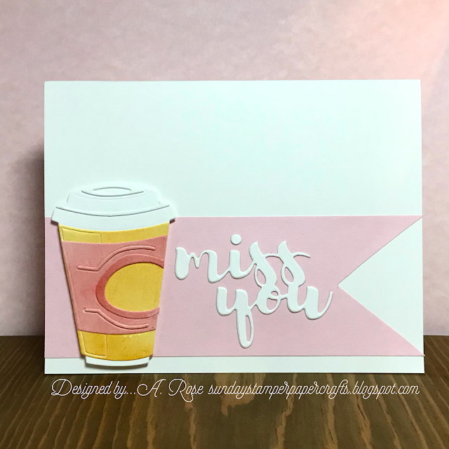
My eyesight must be getting a bit off…especially the color aspect.
The cup holder looked very much like peach parfait but now I’m seeing more yellow tones!?!?!
The base card is white car stock with a flagged piece of pink card stock applied, note I flipped the sketch.
Using the colors I thought were perfect I die cut pieces using Tim Holtz “Cafe, colorize” and glued that to the card front.
To finsih I die cut the sentiment using a die from love nicole with white card stock.


This is a clever take on the sketch with your coffee cup in the space of the rectangle and I really like the diecut sentiment on the banner too - a great wat to preserve all of that white space. I think the colours are fine too. What a perfect take on the double - thanks for sharing over at CAS Colours & Sketches this week!
ReplyDeleteLove this Arlene - CAS and as stunning as ever! Great use of the sketch
ReplyDeleteStay safe
Blessings
Maxine
This is a very cute use of the colors!!! I find that the hues of my photographed cards don't always match up to my card in real life. We understand totally. Thanks so much for your continued support of the CCS blog Arlene!
ReplyDeleteI love the way you spun the sketch Arlene and the clever use of a coffee cup as the rectangular element. The colours look perfect on my screen! Thanks for sharing at CAS Colours and Sketches this week! Vicky x
ReplyDeleteGreat combination of colours and the sketch! Thanks for joining us this week at CC&S:)
ReplyDelete