Thursday, July 28

My final posting for a little while...


I just can't stop playing with this Penny Black image!!!
using watercolor paper and Distress markers I colored the image and stamped it.
Layered it onto burgundy card stock onto a white base card.
The lettering is from a Tim Holtz line from Sizzix that I had to use.

I will be entering it in the...
Keep up your challenges!!! 

Christmas in July, just before the end of July...


This card is definitely not red or green, the colors normally associated with Christmas but I have a friend who hunts and I thought this would be the perfect card for him.

The theme comes from...

I layered blue cards stock unto a white base card.
Using my Misti tool and the Stampin Up background stamp I call plaid I inked it one way with grey and another with blue.
Trimmed my plaid and placed on the card.
 The deer and the verse are from a set of stamps with the deer die by Hampton Art Stamps.
I put foam behind the deer head so it pops off the card.

So there you go a "Blue Christmas" card.
Appropriate really as he never gets a deer!
 

Wednesday, July 27

It's a die cut kind of night...

I have used Impression Obsession stamps for years.
But lately I have truly fallen in love with their dies! 
The above card was done with two of their dies from the following sets...
Words from DIE174-W
Birds from DIE154-A
I will be entering this creation in the...
 
I used cream colored linen for my base card.
I cut a circle from a large Post-It note and placed it on the front of the card.
Placing another sheet of paper over the circle I sponged blue dye ink for the sky.
I removed the circle, placed the other sheet back on the card front, and sponged  first yellow dye ink then gold near the bottom.
Once that was done I sponged green dye ink on the bottom, also pulling some of the ink upward to make it look like grass.
Once the birds and word were cut from gold card stock and glued on the card was finished. 


Ohhhhh, this was a fun one...

I mainly do cards.
It's part of my ministry to the world.
HOWEVER...
once in a while, as for this challenge I am called upon to try something different.


 I started with the challenge criteria...

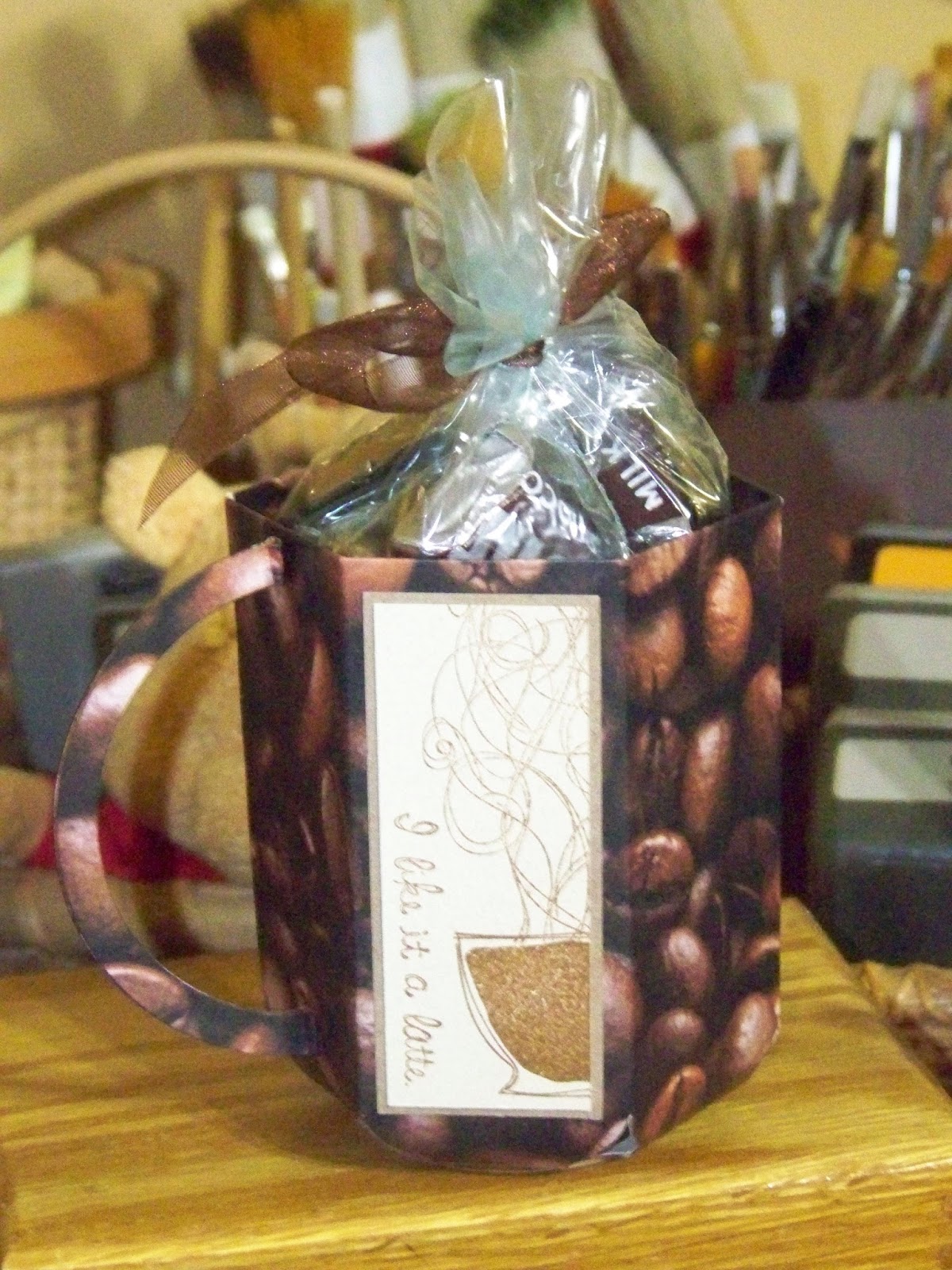
I knew I wanted to try using my punch board so I dragged it out.
YouTube is a wonderful place if you need help.
I found a video for "Envelope Punch Board Treat Mug by Linda Parker".
I dug through my patterned paper and found  coffee beans.
My Stampin Up "Like It a Latte" felt perfect for the additional pieces along the side of the mug.
Using Distress ink vintage photo I stamped the images and glued them to the mug.
Linda Parker calls for using an oval die but mine were too large for the mug. 
I ended up using circle dies instead.
Also my patterned paper was white on one side so where the handle comes together I used my Distress marker of vintage photo to rid myself of the offending whiteness!

I used the candy I had purchased as a treat for me and will figure out who to give it to very soon as I don't want it to melt.

See you for the next challenge!
 

Another clean and simple challenge...

I love doing challenges.
Sometimes I read the requirements and immediately think of what I want to do.
This time I went through my stamps that I have owned for years and pulled out my Ziggy images.

 This card will be for the ...

 After stamping Ziggy on white card stock with black Staz-On I colored him using Prism colored pencils.
I then layered him onto black card stock then onto a white base card.

(I just realized I may have never told you what my interpretation of a "base card" is. It is the folded card that accepts all the layering, etc.)
 
This is one of those cards where I didn't use a verse...yet!
He will go into a box for the future when I will need just this image.

Less is More Challenge...

I always feel that less is more!
I go by the "Keep it simple stupid" motto.
I try to do more but I like clean lines and simple cards that anyone can copy.
This card is no exception...
For the ...

The base card is white linen...try closing your eyes and gently running your finger on it...tactile!
The blue layer is another card stock like bazzill.
The silver snowflakes are die cuts from a Hampton Arts set I have.
They are also glittery...again tactile.
The top snowflake is made of white linen card stock and the verse is stamped in Adirondack denim.
It was then raised just a bit using glue dots for a bit of 3D.

Less for sure and I do believe I accomplished the tactile part of the challenge.
 

Cas(E) This sketch #182...


Sometimes you just need to do something easy.
The idea came quickly...the card not so much.
This card is for ...

I pulled out the patterned paper and wanted to make a tablecloth look for a picnic card.
Sounds good, right?
But by the time I found the stamps and stamped the images and colored them in using markers that I wanted to prove were inexpensive but fun to use...blechhhhh!
Instead I cut the patterned paper and glued it to the card.
Found my Sizzix sewing machine stamp and stamped it on using Staz-On black.
Then found my verse from Our Daily Bread Designs and stamped it also with Staz-On black.

I feel the look is clean and simple.
The card actually was simple as well if you cut out the first card!!!

Tuesday, July 26

While I wait for the Tim Holtz Crazy Dogs to come out I pulled out my Crazy Birds...

Which was great as there was a perfect challenge for this...


 They "guys" were stamped with Staz-On black and colored with watercolor pencils.

I will also be posting for the...

So seriously folks, with all the craziness in the world today, what if the Hokey Pokey really is what it's all about???

Monday, July 25

Mod Squad Challenge...


I have been going through my patterned paper with a vengeance.
I am not doing as much scrapbooking as I used to so I had TONS of 12x12's waiting to be used in card crafting.
I also love kraft papers.
I used the Mod Squad challenge to layer the above card and used it to cut out my Tim Holtz crazy cat.
The fishy is from the Tim Holtz crazy cat collection as well.

The coloring for the...
is also on the cat using chalk pencils for a shaded look.


Sunday, July 24

Tim Holtz to the rescue...

I love my Tim Holtz stamps and colors.

For Day 20 of the ...
I pulled out my Distress markers, Tim Holtz "Possibilities" & saying Stuff" stamps and Tim Holtz "brick wall" embossing folder.

Tim's tools were helpful with the shading but I also like my Colorbox tool with a foam cat's eye attachment.
This male birthday card will also be a part of the...


I purchase stamps all the time but don't always use them right away.
These challenges give me a reason to pull them out, use them, experiment  and have cards for the future!
 

Saturday, July 23

Day 19 and more...


There doesn't look to be much coloring on this card for the...


but there is!
The Stampin Up image cried out for my chalk pencils for that soft, natural look.
The burgundy card stock is embossed with the We R Memory Keepers folder that comes in their "Quilted" set.

I will also be placing this card in the ...

This flower is so precious to me since my Grandaughter, our very own Christmas Rose, was born on Christmas Eve two years ago this coming Christmas Eve.
For those of you who don't know our last name is Rose!

Happy Christmas in July stamping. 

Friday, July 22

Day 18...

I don't usually buy from art supplies from Amazon.
But during this past "Prime Day" I had some time to check out  their deals and found Derwent Inktense pencils on sale.
I had the 12 pack and loved them but wanted more.
Got the 72 set, brand new, for $64.99 with free shipping!!!
I use them often for my watercoloring as I like the richness of the colors they produce.


 The watercolor in this is the flag.
If you follow my blog, you know I send to servicemen and women coming home wounded.
I love this image from Stampin Up as well as the verse.
Putting the flag behind just seemed right.

I will be entering this card in two challenges today!


Join me in the challenges.
You never know you might win an prize!
 

Thursday, July 21

My stash favorite is...


 Kraft card stock!
This card is for two challenges...


and


I do love my kraft card stock and in this card I used it as my base card but added some dimension by scoring above and below the image.
The image is by Stampin Up and I used Distress inks for the image and verse. 
Sometimes coloring means one color.

It's day 18 of the color challenge and I may make it to 30!

Wednesday, July 20

Love playing with new things...

A few weeks ago Michael's had a sale where you received 40% off all your regular purchases for one day.
I have a LOT! 
But I never had enough tape rolls for my tape gun.
 I rushed out and stocked up, however I also went down the die cut aisle as Michael's will take a coupon for die and JoAnns won't.
There was the set I had been watching for awhile.
It's a rick rack set by Sizzix, it jumped right into my cart!!!

Today was my chance to try it. 


I had the paper pack with the dotted paper so I ran it through the Cuttlebug with the streamer die.
The balloons are the same paper using my Marvy balloon punch.
The saying is part of a set of extra long sayings by Hero Arts.


I am joining a challenge and challenging those who come to my blog...

I am very interested to see how many people I can get to 
"Follow"
my blog.
Down on the left hand side of my blog under my blog list and above the ODBD Link is a place to click labeled 
"Follow".
I am trying to be better about posting more often.
I feel that if there are more "followers" it might encourage me to do so!

Now for the Challenge I am entering...


The challenge is a Nautical Theme.
I had a paper pack by DCWV that I was waiting to use for something "New Englandy" .
It's called Nantucket and I felt this was the right challenge.
The card is very simple.
I cut the ship from the paper pack, stamped the saying (which I just knew would work well for the theme) using Distress ink brushed corduroy, sponged around the edge of the card with the same ink and layered it onto kraft colored card stock.
Yes, it is very simple but sometimes simplicity is all you need.

Well I did my challenge.

Will you do yours??? 

I have taken a page out of a friend's challenge notebook...

When possible I am going to enter one card in more than one challenge.
lynda does it all the time...

So the card I made today will work for the...

as well as... 


As  you know, if you follow my blog, I took all my roll-a-graph stamps off their wheels. 
They have all been brushed with "Aleene's Tack it Over and Over" and allowed to dry (this gives them tackiness for sticking on the plexiglass block my husband made).
The image used above is from Stampin Up and colored with LePlume markers. 

This card will also be part of the 100 plus cards I am donating to lynda's church.

Love to multitask!!! 
 

Tuesday, July 19

I found this at the last minute...


It was a perfect way for me to use my hidden away roll-a-graph images that I had taken off the roll.

 I know most people would have colored this bright and beautiful.
I have been watching the old "People Are Funny" shows starring Art Linkletter in black and white.
They gave me the idea for this card! 
Shades of grey.

The images are from Stampin Up and the medium I used to color them are colored pencils from Prismacolor. 

What could you imagine this scene done in?

Day 15 (Phew all caught up) ...

So after today I will post daily...I hope?


The stamps are Stampin Up and the ink is actually STaz-On timber brown.
The coloring medium are chalk pencils.

Hope you find inspiration! 
 

Day 14...


Stamps by Stampin Up.
 Paper from a pack at Michael's.
Coloring medium chalk pencils.

One more to catch up! 
 

Day 13...


Stamps by Stampin Up and colored with LePlume markers, except for the snow which is white Colorbox.
 

Day 12...


Stamps by Stampin up and colored with chalk pencils.

I realized this was also a framed card so I will be entering this in the...

Day 11...


Not much coloring here but the challenge was for only 5 minutes a day and I made multiples of this card.

Snowmen stamp by Stampin Up and colored using Distress markers.


Day 10...


Stamp by Stampin Up and colored using LePlume markers!
 

Day 9...


Stamps by Stampin Up and colored using Prisma colored pencils.
 

Day 8...


Stamp by Stampin Up and colored with LePlume markers.


Day 7...

Of the


Once again colors were decided by the paper pack from Michael's.
Stamps by Stampin Up.
Trees colored using LePlume markers.

Onward... 
 

Day 6...


Of the


 I saw this card, or one very much like it, on Splitcoaststampers.
I shy away from sequins but thought they looked cool on this one.
The background and the Santa are Stampin Up.
Santa is colored using LePlume Markers.

On to the next!

Day five...

I just realized this morning that I have been coloring all along.


So I have decided to catch up with posts of the project I have been working on.
Every December my friend lynda of the
 sends out Christmas cards from her church to shut-ins.
This year I decided to help by making at least 100 cards for her project.
I make multiples of different cards and while making them I realized I have been coloring every day.

so here we go with multiple posts to get caught up an the Daily Marker Challenge!


The snowmen are from Stampin Up.
The colors are based on the patterned paper pack I purchased from Michael's. The coloring was done with Marvy markers.
Not really my colors but to each his own.

More posts to come. 
 

Thursday, July 14

New challenge blog but not a new product...

I love Paper Smooches!
There are many of their dies in my collection.
Just ordered two more today.
 Because of that I decided to try my hand at their challenges.


 I used their mini cupcake die for the top of an ice cream cone.
I cut the cone using my paper trimmer.
I added a bit of shading with foam and Distress inks.
The sprinkles are a die that come with the cupcake.


 Enjoy!

a color challenge...

I rarely do color challenges as I usually don't have the colors.
 This time I tried to match them with what I had.
Pretty close, so here's my submission..


 I used a Stampin Up set called "Sassie Suzie".
"MY" colors were Distress Inks Bundled Sage, Victorian Velvet and Peacock Feathers.
I stamped her using Staz-On black and colored with the Distress Markers.

 I just had to show you the inside!


Simon Says gets double today...


This is a great challenge.
I have been putting scenes together for years and actually have had a few published.


Sometimes they can be very intricate with a lot of masking.
Sometimes they can be as easy as drawing a line for your eye to level.
I found this Art Impressions set recently and thought about all the friends we have who are going through health issues and just had to have it.

I stamped it using Staz-on Timber Brown and colored using Prismacolor pencils.

Have a giggle! 
 

We have the oddest "flora and fauna" this year...

I think it's because of the drought.


But when I found this challenge I decided to think positively.


My viney flowers are not growing this year.
We can't even get the pumpkins to grow and we water almost every day.
We are lucky we have a creek that never dries up.

However we still have butterflies and as this card shows they can look really nice on a vine.

I colored the background stamp with markers, sadly I don't know  which company it comes from.
The butterfly die cut is from a big set by Spellbinders. 

On to the next challenge. 
 

Challenge number six...


I adore the B-I-G Penny Black stamps.
My collection is full of the floral and Halloween images. 

Today for the 


I chose one of my latest images
"Pop Pop Poppy"

Using Distress markers to color the sections of the image I then used my Mini Mister to wet it up again and stamp the image on the front of a piece of linen card stock. 

Just looks like Summer to me. 

This challenge is a bit odd...


You will look at the card and think...REALLY!

But hear me out. I have been thinking a lot, as I am sure we all have, about what is in the paper and on the news.
Trying times to be sure.
Everyone says there is no way for things to EVER get better.

I believe that with faith in God and a positive outlook things will "grow" better.
As Ecclesiastes 3:7 says...
"A time to tear and a time to mend"
We are certainly in the tear stage at the moment. 
However we have been in the past as well and we have grown in ways to mend the future then and now. 

So if this doesn't exactly fit the theme then I am fine with it coming down. 
I just hope enough people get to read it and have hope for the future. 
 

Never tried "Distress Lifting" but here goes...

Challenge number four is a new technique for me.


I thought I'd give it a try as I didn't have to buy anything.
Had the Distress pads and pens, the watercolor brushes and the water... before the drought takes it all!


Once again I was trying to think cool so out came the Tim Holtz Christmas Tree stamp and die set.
Used my markers to color in the tree and stamp it on water color paper.
Then used my watercolor brushes to smear the ink around.
Allowing it to dry, I gently "pulled" some of the color off with the brush.
Love the light and dark tones in the tree.
The gold strip along the side was made by cutting the strip and rubbing the pad over it.
Once it was dry I went in to pull some color off.
 
So glad I tried a new technique.
 
How about you?
Trying and challenges or new techniques?


Challenge three...Ohhh Baby

I decided this did not have to be literal.

As you can see by the card below... 

I had just received the two die sets of cats
 (DIE083-K and DIE 328-G)
which lead me to look and a Mother cat and her babies.

Storytime
When I was twelve I visited a farm in Pennsylvania. There had been a fire in part of the upstairs and a Mamma cat and her babies had been caught in it. Sadly Mamma didn't make it but the babies did and loved to cling to your clothing. Their little eyes weren't even open yet. They were weaned by the girl who lived at the farm and became great mousers in the barn.

Sadly I am now deathly allergic to cats but I cat still stamp and die cut them!
 

Challenge 2...FMS245...


Shhhhhhhhh.....
don't tell hubby but this is his birthday card!
Luckily he doesn't check out my blog unless I suggest it.

The hammer is from a Stampin Up set called "Totally Tools".
I stamped it on white card stock with black Staz-On and colored with my Distress Markers. 
The bottom is a Cuttlebug embossing folder. 
I found a paper pack at Michael's with sheen look paper and it was perfect for this. 

I don't usually use square cards but I don't have to mail this one!

I'm on the challenge trail again...

Honestly if the granddaughter isn't here I really don't want to do anything but stamp!!!


This first challenge


 made me think of Christmas.
We are in a severe drought and have to keep the air on all the time.
 I thought of Christmas to try and get my brain thinking of cooler times.

The card top is stamped using Stampin Up "Organic Outlines" and black Staz-On ink.
I colored it using distress pads and water color brushes.
Once it was dry I stamped the Merry Christmas using CTMH stamp and black Staz-On.

I added the ribbon and layered it and it's ready to post! 
 

Sunday, July 10

Okay just one more...

I was going to start figuring what to make for dinner but as I was closing out my blog  this jumped out at me...


and it made me think of my favorite summer set from Stampin Up called "Sketches".


The lady in the chair is from that set and the verse is from "Season by Season" also from Stampin Up.

I love this set because I think my favorite medium from back in high school art are pastels.
Easy to blend and give such a lovely soft appearance. 
 I stamped her using Staz-On black, seriously seems like that's all I use!!!
I used my chalk pencils to outline her and drag the color with stubs from the art store.
To finish the look grabbing the nearest circle implement I had, my large roll of tape, I drew around the inside with the pencil.
Then blended multiple colors for the sun, sky and sand using my best tool, my finger, to blend the colors.

Have a wonderful rest of your Summer if I don't get back to my blog sooner!

Challenge 5...


I just love this set.
It's by Stampendous named "Petal Plus Set"
There is a butterfly body, 6 different wings OR petals,2 flower centers, one stem and 5 verses.
You can mix and match all you like.
I thought they were very cartoon-like and so I wanted to work with primary colors.
All the layered paper is card stock.
I  stamped the butterfly on white card stock with Staz-On black and colored and shaded her with Prisma colored pencils.
The verse is stamped with the same Staz-On black.

Well I'm starting to wear down and it's almost 4 o'clock so this may be my last challenge for a while.

Take Care!